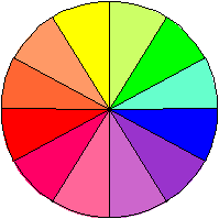
Describing Color:
Hue - Described as being in the same color family.
Value - Relative lightness or darkness of a color depending on a neighboring color.
Intensity - The degree of color.
Primary colors are the pigment colors that all of the other colors are made from. These colors are blue, red, and yellow.
Secondary colors are two primary colors mixed together.
Tertiary colors are a primary color and a secondary color mixed together.
Color Families are groups of colors that are made from the same colors.
Neutral Colors are gray , white, and black, that contain no other identifiable colors.
Monochromatic colors on the wheel are one basic color (hue), but have different values (lightness (tints) or darkness (shades)).
Adjacent colors combine two or more colors located next to each other.
Complementary colors are opposite each other. Red and green are complements, as are yellow-orange and blue-violet. Use a subtle color and a dominate color to avoid clashing.
Triad colors are three colors that are used together, with one being the dominant color and the others being accent colors.
A four-color combination of equidistant colors, such as green, red, yellow-orange and blue-violet, is known as a "tetrad."
Enough! I can hear you say,how does this help me pick a color for my faux finishing technique!
OK, In practice, any color that lies on the opposite side of the color ring will balance and enliven your main color.
Blue and orange may look harsh together, but blue works well with yellow, which is on the opposite (warm) side of the color ring.
When you combine complementary colors, wander around the ring a bit. Sometimes it's more interesting when the colors are not direct complements.
Harmonious combinations consist of colors that lie side by side on the color ring. Red, red-orange and orange are analogous (or related), and so are blue, blue-violet and violet. The key to an analogous scheme is a common color,say Yellow and related colors of yellow-green and yellow-orange.
Another basic guide to use is stay with similar intensities to link different colors. In other words, use clear colors with clear colors and grayed colors with grayed colors.
One-color combinations, referred to as monochromatic, may sound boring, but when planned well, can be serene and elegant. This is by far the safest approach when doing faux finishes. The complimentary colors can be used in your furnitue and other fabrics,art work etc.
A trip to your local paint store will be a big help in selecting your colors. The color systems today are arranged so that all the working colors are grouped making it a lot easier to choose your color schemes.
Remember to start with your basic color,say you are stuck with canary yellow tile in your bathroom, or in the case of choosing a new wall color combination for a room, or a color that you like or need to work with.
Decide if you are going with a monochromatic, or one color scheme, a Complementary color for a little more dramatic effect, or a Harmonious color combination, not quite as dramatic but more life than Monochromatic.
For the Latest Color Trends of 2013Bejamin Moore Paintscolor selections is terrific for showing the latests color combinations.
Another Great Tool is on-line thanks to Benjaman Moore Paints.You can Paint your Room Online!